
Alaska Airlines is a major American airline headquartered in SeaTac, Washington, within Seattle metropolitan area. It is the fifth largest airline in the United States when measured by fleet size, scheduled passengers carried, and the number of destinations served.
Part of a successful airplane journey with a pet is to be prepared for the trip and take the specific airline rules and policies into account, know what to expect throughout the process, and have confidence and knowledge to troubleshoot. Being in the unknown environment adds to the stress of the trip for both pet parents and pets.
I want to examine the top pain points in the process of air travel with pets to provide the tool that would make this experience more manageable and enhance the level of comfort during the process. The new feature in the app needs to be seamlessly integrated within the existing brand guidelines.
For this project I leveraged data from the research to create a new feature that could be seamlessly integrated into an existing product and minimize the feeling of insecurity and stress and prepares the user for the next steps in the travel process.

Below are the areas I’d like to explore during the research. I want to understand:
What information and tools are available to the users before and during travel and what info is missing.
What are the main pain point of the process of air travel with a pet.
How technology can have a positive effect on this process.
App and website analysis to discover what info on the topic does Alaska Airlines provide.
Evaluation of the current process of onboarding with a pet to discover pain points.
In-depth user interviews with people who decided to take their pets on the plane with them to learn about the first-hand experiences.
Secondary research on the current process of traveling on air with pets.
To understand the current experience and pain points in the booking and travel preparation process, I decided to evaluate the information available on Alaska Airlines website and app. Here are some of the most important things that I have found out:

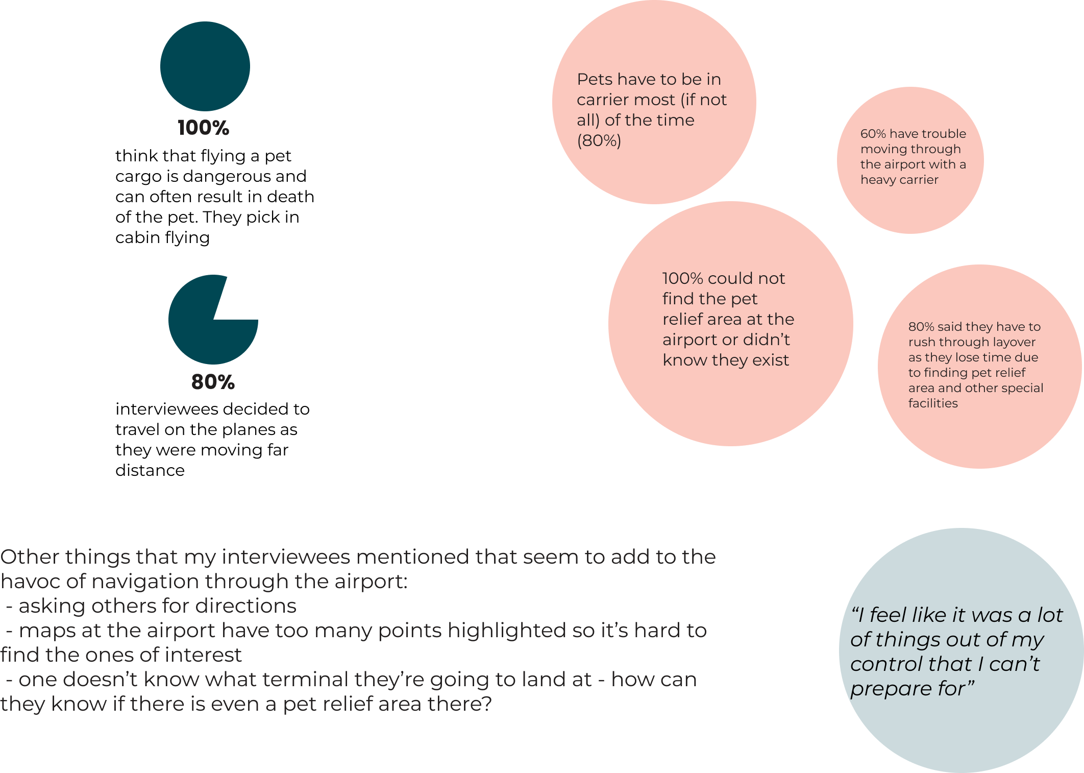
To get the full picture of experiences of air travels with pets, I interviewed 5 people who have taken their pets on both domestic and international flights. Below are some insights and highlights:
As the process of pet travels consists of several steps and layers, I created the service blueprint that allowed me to fully understand where the most friction points are and how can I improve the process. I used all of the data I could gather through other parts of the research and compiled it in the tool below.

After conducting my research, talking to the users and going through the service blueprint, I decided to create a POV statement matrix to address the biggest concerns and patterns that I noticed during the process of air travels with a pet and think of ways to address them. What surprised me was that even though the process of booking the travel and preparation is cumbersome, the most ambiguity happens while the users start the actual travel process and have little space to navigate the situation. They need the tool that would help them feel better when they have limited space and resources to troubleshoot.

Next in the process I was able to address two biggest pain point moments that happen during the process stating from the consideration moment. As the anxiety around the unknown during the travel is high, I decided that keeping the user in the know can reduce the stress of the travel and make the whole experience easier.

When I got to the point of really understanding the user, the time has arrived to brainstorm the potential feature that should be designed during this project timeline. Must Haves are the features that are feasible to design within the project timeframe.

One of the challenges of this projest is to seamlessly add a feature to the existing product architecture. To do that successfully, I needed to examine the existing product map to determine where the new feature can be discovered naturally by the user. I decided to add the functionality from the Must Haves feature roadmap to the personal trip profile page and connect it with the umbrella of Fur-st Class™ care, as it fits into the brand and is directed at making pet travels easier. As certain pages are inactive due to the normal travel process (check in, boarding pass), Fur-st Class™ care will be active only for users with existing ticket for their pet once the departing/layover/landing terminal is assigned.

Having a ready app map allowed me to create the user and task flows. User flow assumes the user is checked in for the flight and has an assigned terminal for the departure, layover, or landing. As the feature is designed to be used on the go, the discovery process is supported by push notifications.
Task: User wants to check out pet-friendly amenities.


The next step in my process was creating a low fidelity wireframes. Before settling on a more final version I used to build the full task flow, I explored a couple of options using different button styles from the existing Alaska Airlines app and played with the map size as well. I selected the rounded buttons as I believe they worked best with signalizing the selected state, were supporting the cohesive visual storytelling aspect, and because of the bigger size, were easier to be used on the go.

Iterations
The first version of lo-fi wireframes allowed me to run early tests and discover the priority revisions that need to be implemented before I start building the high fidelity prototype. The version below includes the revisions made to the information architecture and microcopy such as:
Removed the Add to Route button - testers thought the points of interest are added to the route already
Renamed Select route button to Start route
Made the map bigger
Part of the challenge of this project was to incorporate the new feature smoothly, which meant I needed to adhere to the Alaska Airlines brand standards. As the feature is heavily priented towards the visual aspect, I created a set of large icons to help the user navigate and discover the functionality.

I tested the 2nd version of the prototype with 11 users to see how the updates I made improved usability and overall experience of using the new feature. Some insights are presented below:

Long-term recommendations
Add touchpoints to the map as the research indicated the users were inclined to tap on the map
Add option to search by amenity name
Add an option for offline use in case of no network access
I started this project with a broad idea to discover the pain points in the process of travelling with a pet and figure a way to make it a more pleasant experience for both animals and pet owners. As the research showed, there is a lot of unknown that cause the distress, I believe that preparing the user for success when they have to operate fast and under stress, can eliminate some pain points. Ideally in the long term, this project could go beyond the digital experience and address the physical touchpoint in the process, that would overall improve the service.
